I’ve been researching successful indie authors the past few days to get an idea of how I can maximize book sales. One point that gets hammered is the importance of having a good cover design. Word on the street is find books in the genre you are writing in, see what cover designs sell the most books, then get a cover similar to them. If it were up to me, this painting I made would be my cover for Way of the World – Michael’s Story:
And I feel it would be complement the cover to Way of the World – Adam’s Story:
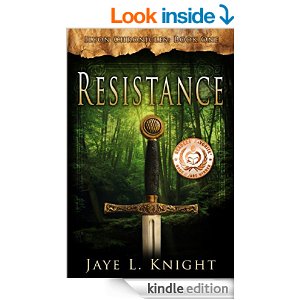
Unfortunately, one truth I have learned about people is they’re much more likely to purchase a product that seems familiar to them, rather then branching out to try a product that seems unique and different. Here are my top three cover selections from the genre of Christian Fantasy:
Each of these covers was designed by a different cover artist. G. and J. publishing, Lookout Design Inc., and “Resistance” credited four various contributors.
Perhaps I’m dreaming big, because I have no idea whether these cover artists are even available, willing to work with me, or even within my budget. Still, these covers are impressive, and each contributed to a book that found its way into the top 100 bestsellers list for Christian fantasy.
What do you think? Which cover design is your favorite? Am I fooling myself by thinking the paintings I made would make good covers? Be honest now.
Looking forward to your responses.
– Thomas M. Watt
Author of “A New Kingdom“
- a draw of kings
- Archangel Michael
- Art
- artwork
- bestseller
- Christian
- christian fantasy
- cover design
- cover design artists
- Faith
- fiction
- g and j publishing
- how to market your ebook
- how to write
- indie author
- literary
- lookout design inc.
- marketing
- maximizing sales
- publishing
- Resistance
- self-publishing
- spirituality
- the gift of light
- Thomas M. Watt
- way of the world
- writer


Hi Thomas:
Sorry mate, I don’t think the paintings will sell books. First, they are VERY busy with lots of colour which makes it difficult to put any sort of text over it and still be legible. If your main character is a painter and you want painters to read your book then it -might- draw them to pick it up. I’d recommend trying to boil your book down to a single word or phrase. Kind of like the 30s ‘elevator pitch’ . Take that single idea and design your cover around that. For example, I haven’t read the book with the sword cover but I’m guessing its about ‘defending the faith’ in some way or another. It may also convey that it takes place in the middle ages, but not necessarily. It’s more of an archetype than a symbol. I would agree completely with the advice you’ve received that the cover is everything. Until you have a following of your own that recognises your name, you are competing largely on the basis of your title and cover for attention. Good luck!
Haha, thank you for the honest feedback. I never saw the cover to “Resistance” in that light before, that’s incredible insight. I’m going to take your advice to heart, and come up with a design that’s suitable for the theme and tone of my novel. Thank you.
Hey, again: I first posted this comment in the wrong place:
I like the light and rising heroics of The Gift of Light cover.
I like your promotional teaser posts.
It’s a shame you can’t do those in actual ads.
Co$t, I know.
I could see a campaign of “rebel” indie posters of your blog teasers and illustrations, etc.
Haha, that would be incredible! I’d love to see that. I like the cover to “The Gift of Light” as well. Going to try and contact the illustrator. I’m glad to hear you enjoy the promotional teaser posts, and thank you for saying that.
Pick a simple yet effective symbol that features or applies in your material, add a simple but artistic background and combine the two with a clear title
Photoshop is a dream gig and earlier versions are cheaper and just as good if you’re brave enough to experiment, then get some honest opinions
One way of doing it, the ‘Artworks’ category of my blog is mainly Photoshop and scanned in basic pics, or adapted from simple templates off Google images to get basic shapes, edited for affect
Thank you very much for your input and suggestions. I enjoyed the artworks category of your blog as well.